How to properly create and register a VKontakte group. New VKontakte design - horizontal group cover Company phone number
In this article we will look step by step at how to properly create, configure and properly design the VKontakte community.
Community creation
You can create a VKontakte community by going to the “groups”, “management”, “create community” tab.
Community type and topic
First, you will need to decide on the type of community, depending on your goals, and choose the topic of the community.
Group registration
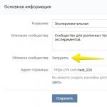
After choosing the type of community, you can move on to the most important thing, this is the design. The design of your community is a kind of business card of the company; depending on how high-quality the design is, your potential subscribers will draw conclusions about your work.
You can download the cover by going to “settings”, then clicking “download”.

On the cover you can place:
- Name
- logo
- motto
- contact information
- promotions or call to action
Important point: The cover is the first thing a client will see when they go to your group, so the cover should be bright and attract attention.

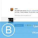
Cover in the MTS community

Cover in the Tinkoff Bank community

Cover in the HeadShot community
Image sizes for designing the VKontakte community.
Cover size for VKontakte group 1590x400px
Avatar thumbnail size is a circle with a diameter of 200px


Also, VKontakte recently introduced dynamic covers for communities.
Dynamic covers have very rich functionality, with which you can display the last subscriber, the best commentator on the cover, set the background to change at your request, add a weather widget, time and much more.
Community Description
In the description, the main thing is to describe as briefly as possible the main advantages of the company.
Important point: there is no need to describe everything that your company has done, is doing or will do. No one will read a long description. You have a few seconds to attract attention before the client starts looking at posts on the community wall. Therefore, the description should contain only key points that reflect the essence of the community/company.
Lifehack: In order to make a description of the community in more detail (with photos, links and beautiful layout), you need to add a wiki post to the pinned post, which will contain a bright picture and a call to action.
Examples of wiki posts:


Group avatar
A community avatar is an important detail in the overall construction of a high-quality design; in this article we have highlighted several very important points that need to be taken into account when creating a community avatar.
Taking into account the fact that now they mainly use community covers, the avatar itself in the group is displayed as a miniature. Therefore, here we will talk about how important it is to design the avatar miniature. As mentioned above, the avatar thumbnail size is a circle with a diameter of 200px.
- Text
If you place text on an avatar thumbnail, it is important that it is large and does not extend beyond the avatar. - Understanding
It is necessary to place an image on the avatar that will make it clear what is depicted. - Minimalism
To make your avatar look relevant, you can make it in a minimalist style: fewer words and unnecessary elements that carry virtually no semantic meaning. The avatar thumbnail must be as simple and readable as possible. - Attract attention
So that the avatar miniature attracts attention. You need to design it so that it is not too white and boring, otherwise it will get lost against the background of the more colorful avatars of competitors.
- Text
What should I put on my avatar thumbnail?
Let's consider options for using an avatar thumbnail to attract subscribers to the community.

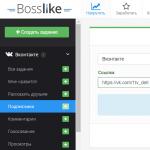
Community Settings
By going to the “community management” tab, you can come up with a short page address and provide additional information. 
Next, in the “links” tab, provide links to your page on other social networks and a link to your website. 
In the “sections” tab, enable the necessary ones. It is more convenient to set up a limited community wall, so as not to rake it in the future from posts by spam bots.
Include products if your community is for selling products or services. 
You can also add applications to the community and customize them for your purposes. For example, the Applications application is the most convenient for working with leads. This is online registration and acceptance of orders. Or, for example, the Maps application, with the addresses of your stores, offices, events. Using the Buy Ticket application, you can sell tickets to events directly on the community page, i.e. subscribers/customers will be able to buy a ticket without going to your website. 
Wiki menu - beautiful and informative
This is another way to show the uniqueness of your community, attract the attention of customers, and also structure services, products and all information about the page. Plus, using the wiki menu, you can set up direct links to go directly to the company’s website.
Wiki menu examples: 


You can see a detailed guide to creating a wiki menu here -
Successful design of a VKontakte group should not only be beautiful, but also functional and convenient. Make design solve your marketing problems so that the group attracts a paying and buying audience to the brand and stays with it forever.
5 steps on how to create a group on VKontakte
Cover
The community cover today is an important tool for designing a brand group in Contact and promoting it. You can download it in the “Community Management” section by going to the “Settings” tab. A high-quality horizontal image in the community header itself plays the role of the company’s main promotional banner on the social network. It sets the mood, informs, enhances the image, calls for targeted actions, and sells at the same time.
1. Use high quality illustrations
The VKontakte community cover should be 1590x400 pixels in size, but it is better to upload a photo 2-3 times larger in .png format. This way you can avoid poor quality display.
2. Adapt the image for different devices
Keep in mind that this image may appear differently on different devices - the edges will be cut off on mobile, so it's best to place all the most important information closer to the center.
3. Place a slogan and USP
Let the client see your philosophy and benefits from the first screen.
4. Display the product/service, process or result of its use
This way, a potential customer will immediately know what you specialize in and will be involved in the product.

5. Help customers contact you immediately
Write your phone number, e-mail, and other company contacts on the banner. If geographical location is important for your business, for example, you are in the catering industry or horeca, the address will also be useful.
6. Announce events
Are you promoting concerts, expecting a new collection or product launch, or holding a festival/conference/client day? Tell everyone who comes to the community about this.
7. Present promotions and discounts
Where else on the main platform can you tell the audience that right now they can place an order from you at 2 times cheaper? Most importantly, do not forget to change the illustration after the offer expires.
8. Offer to take a targeted action

When loading the community cover, two buttons are placed horizontally in the lower right corner - Write a message and Join the group. Point an arrow at them to further attract the audience's attention. So, if a product is shown on a banner, you can offer to order it immediately in messages. And if it contains a digest of the latest news, subscribe to always receive the latest information.
Upload an avatar and select a thumbnail
Some brands still do not adopt the cover, preferring the old look of the first screen of the group, using a combination of an avatar and a pinned post as the so-called “header”. In this case, one picture is a continuation of the other. It looks most impressive when the photo ends on the same level as the avatar.
When using the maximum avatar size of 200x500 pixels, the size of the image in the pinned post must be made 510x308 pixels. An excellent engaging technique is to attach a video uploaded through a social network player, which stylistically continues the avatar.
If you use a cover as a header, the avatar will then always be displayed as a thumbnail.
Rules for designing a VK community avatar thumbnail
A thumbnail is a small round image that is cropped from a large avatar, and is displayed in the search for groups, in the list of communities for each user and on the left under the cover, if there is one. Here are some design tips.
1. The thumbnail should be understandable to the audience

You shouldn't post a piece of weird illustration. Visualize something that the target audience will subsequently associate with the brand, for example, a logo, a product/service icon, or maybe the main marketing character of the brand.
2. Use only high-quality photographs
It’s better to upload the source 2-3 times larger than the required size, so you can forget about the terrible pixel “squares” that do not show you in the best light.
3. Design your own illustrations
Standard stock images will look cheap and unprofessional, and will become synonymous with users' distrust of the brand. Make unique designs in the same concept and colors as the rest of the design.
4. Pictures that contrast with the background of the page are what you need
When designing VK thumbnails so catchily, the “round piece” will stand out in the feed among other groups and will not merge with the background of the page.

5. Place contacts or USP of the company
Depending on the purpose set for the thumbnail, place on it a contact phone number or website address, information about free shipping, an indication of the lowest price in the segment or a promotion.
6. Make the text large and readable
It is better not to use serif or italic fonts - they are too noisy when viewed on PC screens, mobile devices and smartphones, littering the view. Make sure that the text does not extend beyond the borders of the cropped thumbnail. This will allow you to convey the message to the user correctly and effectively.
7. Use custom shapes
For example, in the desired round template, enter a polygon or other geometric shape on a white background. Create an unread notification effect or a graphic “online” icon.
Develop a menu

The menu is an important element of the design of a group in Contact, which makes it easier for users to navigate the group - it will be more convenient for people to find the information they need. Each element and page is created in a special programming language - Wiki markup. Using it, you can make images clickable and create convenient pages within the social network as if it were a website page.
You can use both open and closed menus. In the first case, the user immediately sees the sections that are included in it, in the second, they are preceded by a preview picture with the inscription “Menu”. The menu can also visually become a continuation of the avatar if you use the old community design option.
Develop a product showcase
When placing products in your community showcase, remember that users always see the first 3 items. Place the most popular and most ordered ones in them, uploading a presentation image in the same style. Publish here uniform icons or photos of the products themselves. Services can be placed in products. In the design, show the process of providing the service or its result. The size of such a picture will be square – 400x400 pixels.

Post design
1. Make full use of available image sizes
The maximum width of an image in a feed is 510 pixels. Square images of 510x510 pixels and rectangular images of 510x300 pixels look most impressive.
2. Develop a custom post style
To make your posts look individual, come up with a unified style, font and color scheme.

3. Place short text on the picture
For example, you can divide an image into 2 parts - text and graphic, or write text while darkening the background. To make the text visible without a darkened background, write it on a background (a contrasting graphic block of a uniform color) or add a shadow to the inscription. Photos with a frame look good.
4. Make several templates for different purposes
For example, for quotes use one template for the presentation of visual information, for the announcement of materials from the site - another, and for competitions a third.
Use these absolute techniques, and your company will be presented on VKontakte in the best possible way, and it will be convenient for customers to interact with it. But don’t forget that everything needs moderation! Look at even more fresh ideas for designing a VK community on the services page of the Tesla Target agency.
), make a menu.
Now I'll show you how to make a menu in a VKontakte group and design it correctly.
Making beautiful graphics
In the new design of the VKontakte website, the dimensions for graphics have been changed. Below you will find the current values.
- Avatar for the group - 200x300 px
- Banner in description - 510x271 px
Prepare images in the required sizes. I will take ready-made pictures to show you an example.
So, let's make a beautiful design by dividing the overall picture into two parts. As a result, we will get a single design.
First, upload your avatar. Go to the group and click "To upload a photo".
You will see a form in which you need to select a file on your computer’s hard drive. Do it. As a result, we got the following.

Now let's add the second part of the image. To do this, you need to post a picture on the wall, and then record it with it, fix it in the upper area.
Let's go to the wall. Here on the block "Add a note", tap the Photo icon.

Upload the second prepared image. Be sure to select to post as a community. And then click "Submit".

Now the entry needs to be secured (see). We return to the new entry and expand the menu in the upper right corner. Here we click “Pin”.

Now refresh the page and see the result.

The only negative is that the pictures are at different levels. But this is due to the fact that they are not the right size. The avatar should be larger vertically. Then they will be on the same level.
How to create a menu in a VKontakte group
Let's go back to our example and imagine that we need to make a "More details" button. She's already in the picture. How can we make it a button, so that when clicked, a person will be taken to our main site? I will show you now.
To make active menu buttons, we must cut them out as separate images. For this we need Photoshop.
Open our image in the editor and activate the Cutting tool.
Cut off the bottom part with the button. Hold down the left mouse button and draw a horizontal line, cutting the picture into two parts.


Now press Alt+Ctrl+Shift+S to save the finished images.
Https://vk.com/pages?oid=-120208137&p=menu
Look, after the symbols "odi=- ", you need to insert the id of your group (see). And at the very end of the link, write the name for your menu page. In the example, we will leave “Menu” as is.


Here we click on the camera icon and upload the prepared images.

Now let's move on to creating a menu for the group on VK. It should look something similar.

Next we go to the section "Editing". Here, for each image, we need to remove the padding so that they merge into a single picture. To do this, add the following value in the code: “nopadding;” . And add a link to the desired page or site, entering the value “https://site.ru/page.html” (indicate your addresses!). In our example, the “More details” button should lead to the website. This is what should happen.
[] []

Save the page. Don't forget to copy her address from the address bar. It should look like:
https://vk.com/page-120208137_52523487
We return to the group wall and create a new entry. In it we insert a link to the page and attach the original image. We publish and pin.
This is the menu we ended up with.

Evgenia Kryukova
Beautiful design of the VKontakte community is not a whim, but an important element that builds user trust in you and your company. If a public page or group is designed unprofessionally, your potential clients may quite logically conclude that you are equally negligent in your work. To prevent this from happening, make sure that your VKontakte page is beautiful, neat and easy to use. How to do it? Read below.
Don't have the time or desire to understand the topic? Order the design of social networks from our company. We will develop a single concept for you and provide ready-made templates in .psd format.
Current sizes of VKontakte images
Some time ago, the developers of the social network VKontakte launched a new design. This led to changes in the size and principles of image display. The memo, which will be given below, corresponds to all innovations and contains the sizes that are relevant at the moment.
Now let's go into more detail on each point.
VK avatar size
The minimum avatar size is 200 by 200 pixels. If you try to upload an image that is less than 200 pixels wide or long, you will see an error like this:

The maximum avatar size is 200 by 500 pixels. But, in principle, you can upload larger images – up to 7000 pixels on each side. The main thing is that the aspect ratio does not exceed 2 to 5.
I'll show you with an example.
I have an image. Its size: 200 by 800 pixels (ratio 2 to 8). There are no errors when loading. However, I still can’t use this image, because “Contact” does not allow me to select it completely.

Cover
The cover size for the full version of the site is 1590 by 400 pixels.

Please note: in the mobile version and applications, not the full version of the cover is displayed, but only a part of it measuring 1196 by 400 pixels. See how it is cropped in the mobile app:

To prevent this from happening, position the main elements of your cover within 1196 by 400 pixels.

Attached images
In the updated design of Contact, the width of the news feed has become fixed. This means that the images attached to the post are no longer stretched, but remain as they are. Therefore, if you want your image to fill its entire space in the news feed, its width must be at least 510 pixels. It is best if it is a square or rectangle in landscape orientation.
It sounds a little confusing :) So I’ll show you with an example.
Let's say we have a square-shaped image with sides of 510 pixels. If we attach it to our post, it will look very good in the news feed on all devices:

And this is what a horizontal image looks like in landscape orientation (width 510 pixels):

As you can see, the narrower the image (in height), the smaller it looks in the smartphone feed. To see this, look at the picture below:

It is clear that the difference here is not particularly critical, and smartphone users will still look at your image, it’s just that in the second case they will be a little more comfortable.
Images for posts with links

All this data comes from the Open Graph markup code:

If Open Graph is not specified, the title is taken from the Title meta tag, and the image from the article. At the same time, you can easily change it - or select another image from the article using special arrows:

Or upload yours:

The minimum size of an image that you can use as an announcement for your article is 537 by 240 pixels. However, you can upload larger images as long as the proportions are maintained.

Image for an article created in the editor
The image size for the cover of an article created in the editor is 510 by 286 pixels. It is better if it is dark in color and more or less monochromatic, since the name of the article and community is lost on a light background.
Good example:

Not a very good example:

Photo and video size for stories
The size for photos is 1080 by 1920 pixels. The size for the video is 720 by 1280 pixels.
Technical specifications for video recordings:
- up to 15 seconds;
- no more than 5 MB;
- h.264 codec;
- AAC sound.
Stories must use vertical format photos and videos.
Please note: stories on behalf of communities can currently only be added by large communities for which the VKontakte developers have opened this function. And this is done using the official application. This cannot be done from a computer.
Photo album cover size
Video image size
1280 by 720 pixels.

Wiki page
The content area width of a wiki page is 607 pixels. If you upload a larger image, it will automatically upload at 400 pixels wide. Example: I have an image measuring 1366 by 768. If I add it to the wiki page, this is what it will look like:

To change the size of a picture, you need to click on it and set the desired values:

I will talk in detail about how to work with wiki pages below. Therefore, we will not dwell on this point here.
How to make sure that VKontakte images do not shrink? The influence of background and size on picture quality.
If you've ever tried to upload VKontakte images (it doesn't matter whether it was an avatar picture or just a photo from your trip), then you probably already know that they tend to shrink. This is especially noticeable on a dark (and especially red) background and when the picture is not too large in size. Example:

How to make sure that the quality of the pictures does not deteriorate?
To prevent the image from shrinking (or rather, shrinking, but to a much lesser extent), it is necessary to make it 2-3 times larger than the desired size. For example, if we need to make an avatar measuring 200 by 500 pixels, we take a picture measuring 400 by 1000 pixels. If you need to make a menu with a size of 510 by 400 pixels, take 1020 by 800.
The image on a dark blue background, which I showed just above, has a size of 510 by 350. I made it twice as large (1020 by 700) and saved it. That's what came out of it:

How to fix it? The answer is very simple - you need to choose a different background. The fact is that pixels are visible better on a dark background than on a light one. Therefore, if you want to achieve perfect quality (although the picture above already looks quite normal), then you need to slightly change the color scheme. For example, make the background white and the text blue:

How to design a page header
The header of your public page or group is the first thing that users see when they come to visit you. In most cases, this place contains a navigation menu for public materials, some interesting posts or important announcements. Let's look at examples of how different companies are using this space.
Cover
Not long ago, VKontakte introduced an update - now you can upload large and beautiful covers (1590 by 400 pixels) to pages. To do this, go to settings and click the "Download" button.

On the cover you can place anything you want: from the name and motto of your company, to all kinds of promotions, offers and even competitions.
I recommend paying special attention to the possibilities of a dynamic cover. Read our article about how it works, for what purposes it can be used and with what services it can be installed.
Examples of dynamic covers:
Cover + community description + website link
Some companies specifically do not pin any posts in the header so that users have the opportunity to read basic information about the page and immediately go to the site.
Description with hashtags
Some companies add hashtags to the standard page description that characterize it. This is done so that the page has a clearer relevance, and due to this, it is higher in the search for relevant queries. Honestly, I don't know if this method works or not. I haven’t seen any cases on this topic, so if anyone knows, I’d be grateful if you could share the link.
Pinned post telling what the page is about
If you want to tell about your page in more detail (with photos, links and beautiful layout), then you can attach a wiki post or an article made in the editor to the header, with a bright picture on the announcement that will encourage users to click on it. An example of such a post:
And this is what the user sees after he clicks on the link:

Group menu is open
I call an open menu a menu that immediately shows what items it consists of. That is, the wiki post announcement picture completely duplicates its content. Thus, users immediately see what awaits them inside. I'll show you with an example.
This is what a pinned post looks like in the Flatro page header:

Group menu is closed
A closed menu is the same wiki post as in the previous paragraph, only the announcement contains a picture with no menu items. Usually they write on it: “Menu”, “Navigation menu” or “Navigation through public materials”.
And this is what we see when we click on it:

By the way, it is worth noting that these are far from the only options. Basically, you can write whatever you want on this picture. The main thing is that the user wants to click on it, and he understands what awaits him after that. Example:
Merged menu for a group
A merged menu is when the picture on the announcement of your menu forms one image with the avatar. Below I will tell you in detail how to make such a menu, but for now just look how beautiful it looks.
Do you want to beautifully design your VKontakte community, but don’t have the necessary skills? Order registration from our company. We will prepare for you an avatar, cover, templates for headings, menus and product previews. See examples of our work at the link.
GIF and avatar in one image
But this design option for the hat really delighted me. The automatically played GIF merges with the avatar into a single composition and attracts the attention of users, even though there is no information on it at all.
By the way, I spotted this example in the group of SMM marketer Sergei Shmakov. So, I express my gratitude to him for the find :)
Hidden menu
The hidden menu is only available for groups (pages do not have this functionality). To see it, you need to click on the appropriate link. The advantage of this design method is that users can see the main information of the community, and if they want to use the menu, they only need to make one click. However, there is a small disadvantage here - not all users know about the existence of this function, so your menu may receive less attention than if it were pinned at the top of the page.
Auto-playing video
At the end of November 2015, an interesting innovation appeared on the VKontakte social network - as soon as a user visits your page, the video attached to the header begins to play automatically. With this technique, you can attract even more attention from users (especially those who visited your page for the first time), and at the same time, do not irritate those who do not like having their content imposed on them, because the video plays without sound and practically does not interfere .
How to add such a video to the header of your page?
To do this, three conditions must be met:
- Attach the video to the post and pin this post to the top of the community.
- Apart from the video, nothing else should be attached to the recording. Only video and text optional.
- The video must be uploaded to VKontakte - third-party players are not supported.
A post that gets a lot of shares
Another way to productively use space in the header of your page is to pin one of your most successful posts in it - one that has already received and continues to receive a large number of likes and shares. Why do this, I think everyone understands - the more reposts, the greater the reach, the more subscriptions the page receives.
Announcements of new videos, albums, events
Presentation of new products/services
Discounts and promotions
Cases, customer reviews
Application advertising
Practical jokes
Community Rules
Links to other social networks
I have not listed all the header design options. Basically, you can put any kind of information on your cover page and pinned post: job openings, announcements, links to top-selling products, etc. So don't limit yourself to the examples above. Use your imagination and use the design of your community to achieve your goals.
What should an avatar be like?
An avatar is not only a beautiful image with your company’s logo, but a marketer’s working tool with which he achieves his goals. Let's look in detail at what it should be like in order to attract the attention of users and encourage them to perform the target action. Let's start with the miniature.
Avatar thumbnail
- The text on your avatar thumbnail should be large enough to be read.
- The text should not extend beyond the thumbnail.
- Users should understand what is shown on the avatar.
- If possible, it is better not to use stock images, as they often reduce the credibility of the company.
- It is undesirable for the avatar thumbnail to be too faded and boring, otherwise it will be lost against the background of brighter avatars of competitors.
- If you want your avatar to look modern, make it in a minimalist style: less text, shadows, gradients and elements that do not carry any semantic load. Your avatar should be as simple and neat as possible. This style is currently trending.
- If your goal is to attract the attention of users and stand out from other avatars in the feed, you will have to use your imagination. Think about what you yourself pay attention to when you look for interesting communities? For example, I have been attracted more than once by avatars with a burning light, which usually indicates that a new message has arrived. This is a very old technique, but for some reason it still affects me - when I see such a light, I will definitely keep my gaze on it.


I'm not saying that this technique will work on your page. The point I want to get across is that there are many, many ways to stand out, you just have to ask yourself and be a little creative. Here, for example, is another interesting idea that I would hardly have thought of on my own:

The avatar is a black circle: large and small. It would seem, why do this at all? But when you scroll through the list of communities, such avatars attract attention because they are very different from all the others.
What information can be placed on an avatar thumbnail?
Even though the avatar thumbnail is very small, it can (and should) be used to attract followers to your community. How to do it? Let's look at a few options:
Announcement of a new product/service/event

Advantages of the company/service/page

Company phone number

Favorable prices

Free shipping

By the way, very often the information that the company provides free delivery is added to the group name itself so that users will definitely pay attention to it.

Stock

Competitions

Vacancies

What should the avatar itself be like?
I looked at what the avatar thumbnail should be and what text could be placed on it. Now let's move on to the avatar itself. The full version of the avatar will only be displayed in the community where the cover is not installed. It is for such cases that I wrote this section. So, what should your community’s avatar be like so that users immediately understand that your company approached the creation of the page responsibly and professionally.
- The avatar must be of high quality. I wrote about how to achieve this a little higher. For those who missed this part, I'll tell you briefly - the size of the avatar should be 2-3 times larger than what you planned.
- It is advisable that the avatar be combined with the menu: be the same color scheme, have the same fonts, elements, etc. Thanks to this, the header of your page will look more neat and professional. Example:
- The avatar itself and the avatar thumbnail may be different. For example, you can draw a circle on your avatar, design it the way you like, select that area as a thumbnail, and design the rest of the avatar in a different style.
- In order to encourage users to subscribe to your page or write a message to a company representative, you can place a corresponding call to action at the very bottom of the avatar and accompany it with an arrow pointing to the button.
- Try not to put too much information on your avatar, otherwise it will look overloaded and untidy. Add only the most important points to it and be sure to make sure that there is “air” between them.

Another option is to divide the avatar into two parts. One is for the miniature, and the second is for the rest of the avatar.


What information can be placed on an avatar?
Basically, you can put anything you want on your avatar. Unlike the miniature, there really is room to roam around here. The main thing is don't abuse it :)
Site domain

Phone/address/opening hours

Competitions/promotions

Most purchased products/new items

information about delivery

Mobile app advertising

The main advantages of the company/page/product, etc.

Assortment update/new creativity, etc.

Information that your community is official

Information about upcoming events

Addresses of accounts in other social networks

Extended page description

Brags

In general, you can place absolutely any information on your avatar. I've just included a few ideas so you can see what others are doing and get inspired. Well, keep the basic recommendations in mind: the avatar should be of high quality, the font should be large, and there should be more “air” between the elements.
How to create a seamless avatar and menu
In order to make a merged avatar and menu, you will need Adobe Photoshop or its equivalent. I will explain the whole process using Photoshop as an example. So, let's go.
- Download the Photoshop template that I specially prepared for this article. In normal size (menu – 510 pixels wide, avatar – 200) or enlarged (menu – 1020 pixels wide, avatar – 400).
- Open the image you want to use as a base.
- Copy it, paste it into the template and position it the way you would like to cut it.

- Add effects, text, graphics, etc.

- If you don't want to lose part of the image (in that 50px gap), move it to the right as shown in the following GIF:

- Select the “Cutting” tool and click on the “Fragments along Guides” button.

- Delete unnecessary fragments (right mouse click - “Delete fragment”) and edit existing ones (right mouse click - click in an empty space - take the desired area and stretch it to the desired size).

- Go to the "File" section and select the "Save for Web" command.

- Go to the location where you saved the pictures (desktop or some specific directory) and find a folder called “Images”. This is where your images will go. Now all that remains is to fill them in on the page.

P.S. The height of the avatar can be changed at your discretion. I took the maximum size - 500 pixels, but your value may be less. For example, as on the “Wiki Markup” page:
How to use widgets
Widgets are also part of the design of the VK community. Using them, the user can: place an order, subscribe to your newsletter, take part in a competition, read and leave reviews, open a search in the community, receive a gift, a discount coupon, etc.
Here are some examples of what widgets look like on the VKontakte page:


How to design images for posts
If you are a web designer or have an artistic taste and a sense of beauty, then it will not be difficult for you to come up with a corporate style for your images. However, it seems to me that such people will be in the minority in this article (I, by the way, am not one of them either). Therefore, let's take a closer look at how this is done, based on examples of successful companies.
By the way, please note that almost all well-known VKontakte companies brand their images, that is, they add a small logo, the address of their page or a watermark. This increases brand awareness and protects your images from being copied. Whether it is worth doing this is up to everyone to decide for themselves. The only thing I would like to advise is: if you decide to do this, try to make sure that your logo is not too bright and does not take up too much space, otherwise all the emphasis will go on it, and the image will lose its attractiveness.
Where can I get good images?
We have a good article on this topic on our blog - “”. They are all free, but some require registration. If you don’t find anything suitable for yourself, try searching by keyword + wallpaper (or, if in English, wallpaper). Typically, this type of request results in high-quality images. But here you need to be careful and check the type of license, otherwise, if you have a serious business, you can run into trouble.
What should those who do not know how to work in Photoshop do?
If you have never worked in Photoshop (or any other graphic editors) and are not yet ready to devote time to mastering it, you can use services that already have ready-made image templates for different social networks:
1. Fotor.com


After that, on the left side of the screen, select the template that interests us. Please note that only those templates that do not have a diamond icon are provided for free.


We insert it into the template, select it with the left mouse button, select the Layer command (sandwich icon) and click Move to bottom. This way our picture will go in the background, and all the inscriptions will be superimposed on top of it.

After that, we change the text, font, font size, position of the inscription, etc.

Then click on the floppy disk icon, select the name, image format, quality and click on the Sign in to download button.

2. Canva.com
Another service that will help you beautifully design your image. It works on the same principle as the previous one. Register in the service (you can use your Google+ account or email).

Choose your field of activity. We skip the step where you are asked to invite friends. We get to the main menu, where we select a Facebook post if we need a rectangular photo, or an Instagram post if it’s a square one.

Select a template (if the template is marked “FREE,” it means it’s free), change the text.

If necessary, upload your image, adjust the dimensions, change the text, font and position of the inscription. After that, click the “Download” button, select the image format and save it to your computer or any other device.

How to format articles in the editor
Recently, VKontakte has made it possible to type up articles in a special editor. To create an article, you need to click on the letter “T”:

How to use wiki markup
Well, here we come to the most interesting and at the same time difficult section. Perhaps there are people among the readers who do not know what wiki markup is and are hearing this term for the first time. Therefore, especially for you, I will give the definition that “Contact” itself gives.
Wiki markup is a markup language that is used to format text on websites (usually classified as wiki projects) and allows easier access to the capabilities of the HTML language. On our site, wiki pages are a good alternative to regular posts and text navigation. If you need to create a large article with different text formatting (bold, underlining, headings, etc.) or add graphics to it, or simply create a colorful navigation menu for your community, a wiki is indispensable.
Just like Wordpress (or any other CMS) has an HTML editor with which you create articles, Contact has its own editor for creating and editing wiki pages. It looks like this:

Using this editor, navigation menus are created, as well as articles with pictures, videos and audio recordings. Below I will discuss in detail how to work in this editor, but first I ask you to bookmark two links. They will help you a lot in learning wiki markup.
The topic of this article is the new design of VKontakte. Changed again, now you can set a horizontal cover in a group. Designing your VK community with such a header is much more interesting. Frankly, no Photoshop knowledge is required here. And you can make a beautiful picture even in PowerPoint, Fotor, Canva, Pixlr Editor without any special skills.
By going to the group, you will notice that in those groups the buttons “Pinned entry”, “Information” and “Click menu” have become visible. And before they were hidden. Naturally, all the registration of the groups began immediately.
Uploading a new cover
Now let's figure out how to enable the ability to install a horizontal header. Let's click on the "Manage" button.


Then click on the last one and download the new cover of the VKontakte group. This is where you can understand that the download file can be of any size! But no less than the size 1590x400 px. We create a cover prototype in any editor. Next, we can select and save the area that meets the VK requirements. Here's a tip on where to find a cover image and which editor to use to
What is interesting about the new design of VKontakte?
The main thing: there is more space for information. Now here you can write the name of the group, the purpose of its creation, a call to action, and so on. Such a design will be logically complete and more functional. But you can leave the old design, it’s a matter of everyone’s taste.
When you design a horizontal cover, you will notice that the internal menu now somehow falls out of the general context. I think it would be better to pin the image to go to the menu. And use it to host wiki pages in the group.
At the same time, I would like the developers to add some other option for setting up a beautiful transition to Wiki pages.
I would like to note that since 2016, the developers of the VKontakte social network have been actively trying to set up this network to promote business. Make it more convenient for business or something. From my point of view, this is very good and is in great demand among many Internet entrepreneurs.
But most importantly, in my opinion, they need to carefully consider the “Bans” system so that entrepreneurs can work quietly without interfering with those users who came to have fun on the social network.
How to make a VKontakte group cover online
Use your creativity and choose what you prefer: a horizontal cover or the already familiar VKontakte design. Creating online and installing a new cover is clearly presented step by step in the video below the article.
P.S. I hope this information is useful to you.
P.S.S. Use your creativity and good luck in all your endeavors!
We also recommend
 Getting subscribers to a VKontakte group is paid, but cheap
 Live subscribers to the VKontakte group for free
 New VKontakte design - horizontal group cover Company phone number
 What can be made from computer disks
 Comparison of iPad and Samsung
 How to update your iPhone to the latest version Preparing your iPhone for an update takes a long time
 Loading...